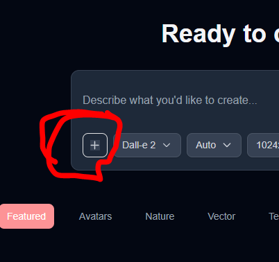
The plus (+) button has a light grey square
There appears to be a small visual glitch in the UI. The plus (+) button on the image generation interface has a light grey square or background area inside the button, which looks misaligned or unstyled. It seems like it's either an incomplete background or a placeholder that's not meant to be visible.
The plus button should be clean and uniform—ideally, it should be fully transparent or match the styling of the surrounding UI without any visible grey box inside it.
Screenshot: (include the image you attached)